@Bryndan W. Meyerholt (BWM): Yes, I tested that version too. It didn't look good. Overall, the current design of Salice Sans is more consistent than Arial Narrow Bold or Impact.
@SquareOctent That's an affricate, which is usually written with a tie bar, but it can be omitted as long as it doesn't create ambiguity. Affricates were historically written as ligatures, but that was dropped in 1989.
@Bryndan W.
Meyerholt (BWM): Thank you for your comment. You dropped a
pebble into my calm and settled pond and stirred up a lot of
things. As a result, I made the dot the same size across the font,
redesigned
@Bryndan W. Meyerholt (BWM): That's a very good point. It should be the same-size single dot, indeed. The dots of the diaeresis can be smaller. What about the middle dot for Catalan?
@marcotoa: I saw you working on this large project. Your
dedication is admirable. However, we need to address some
fundamental issues with consistency,
@marcotoa You appear to have misinterpreted my comment. I did
not say that Հ (Ho) resembled Ը (Et), I said that Ը (Et) resembled
Հ (Ho) because of the part
For accented characters, I decided that the ring in the letter Å
should not be attached onto the top of the letter
A because it can lead to inconsistency with the









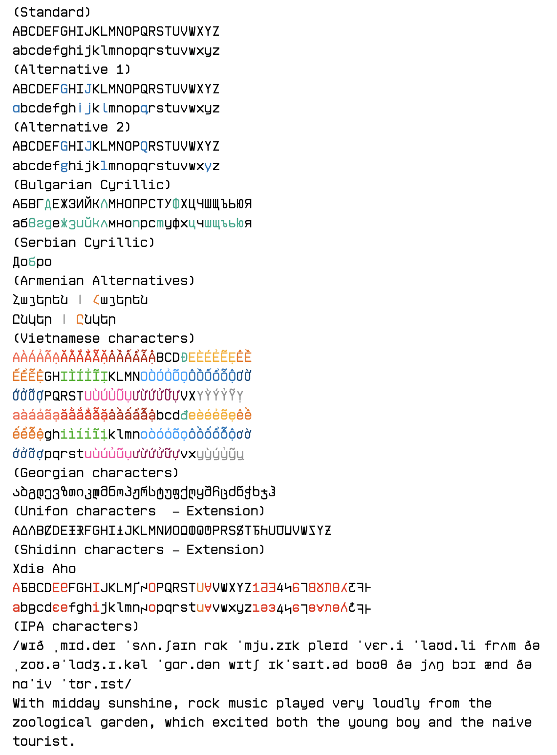
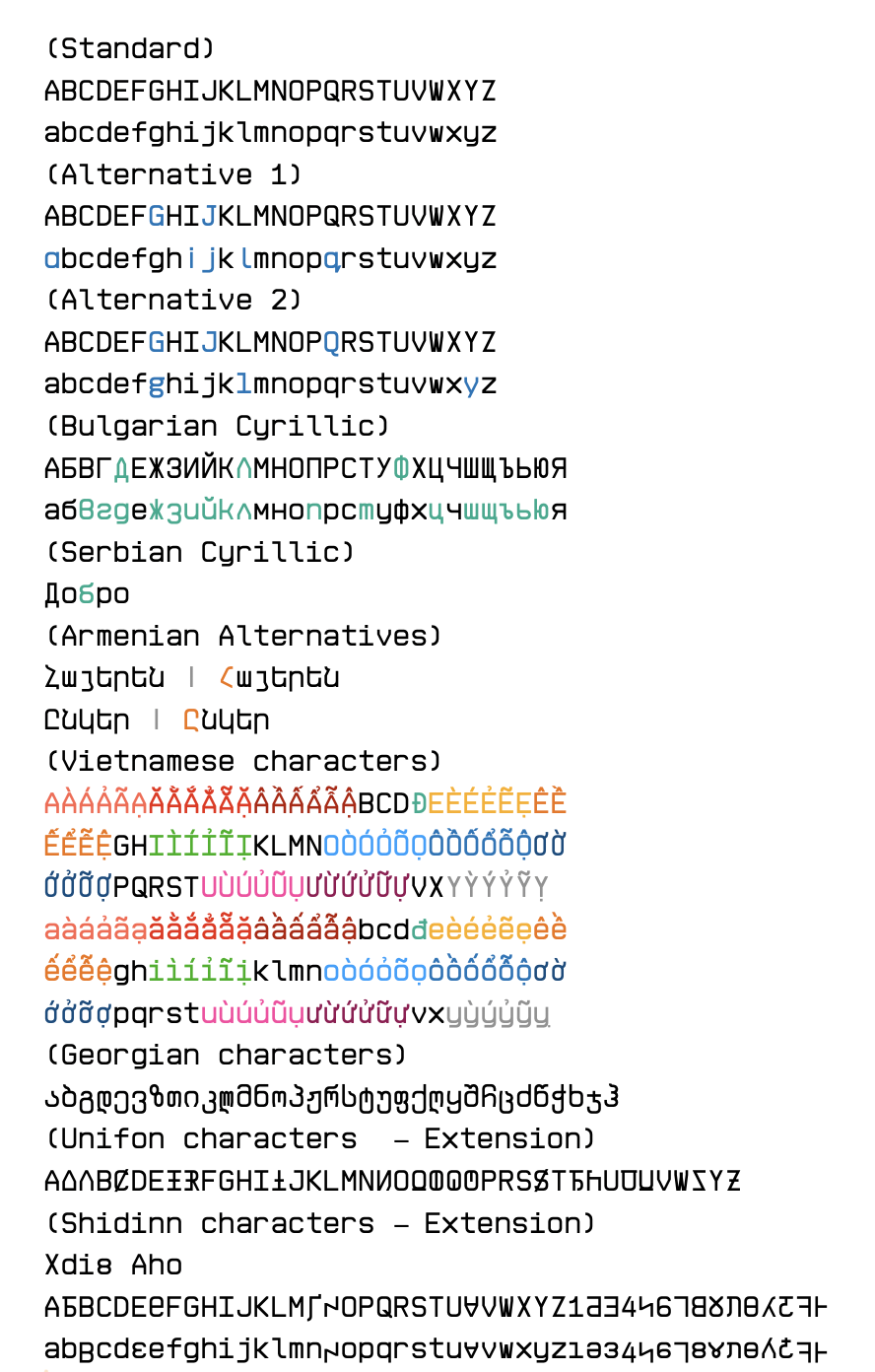
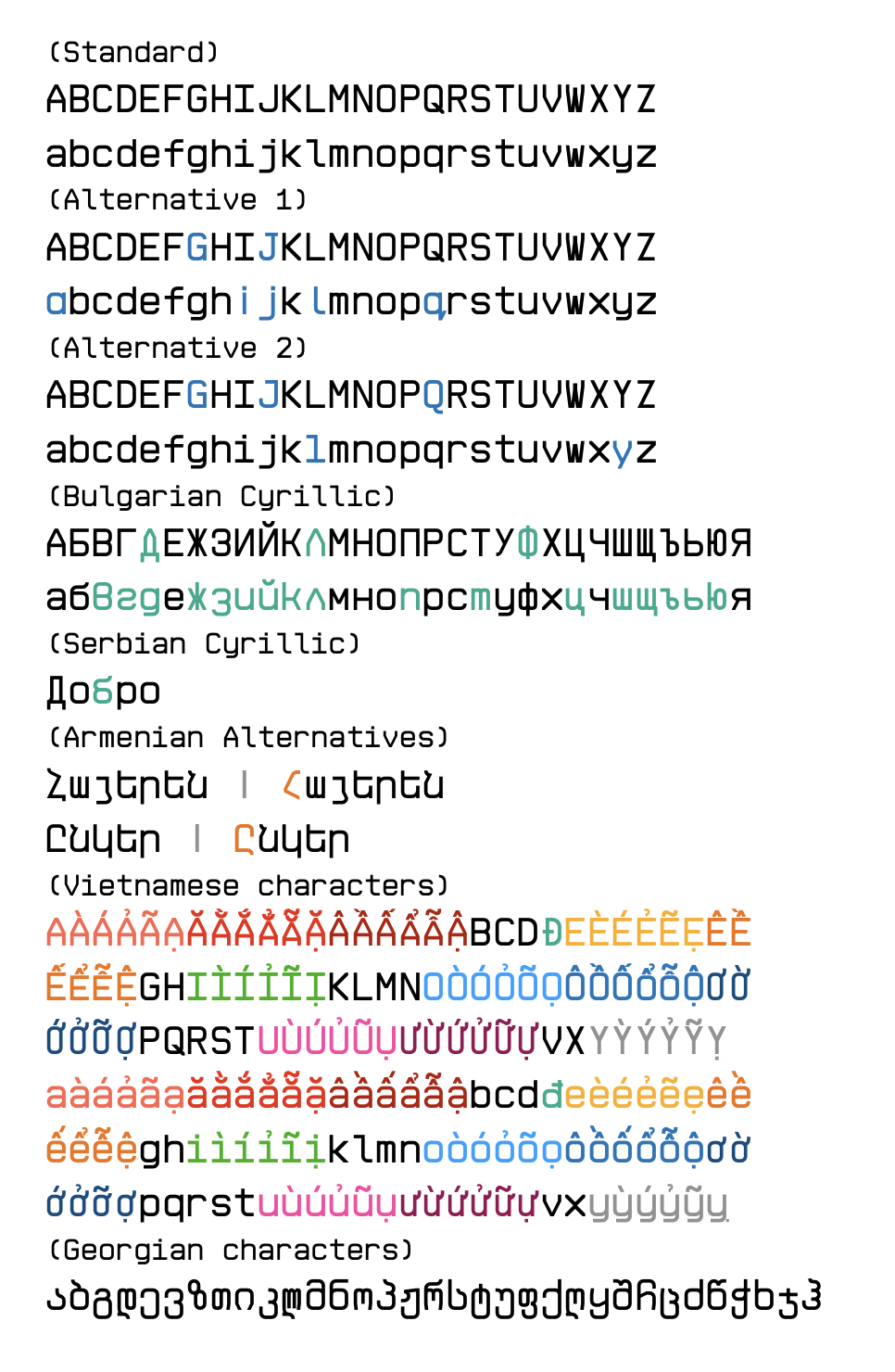
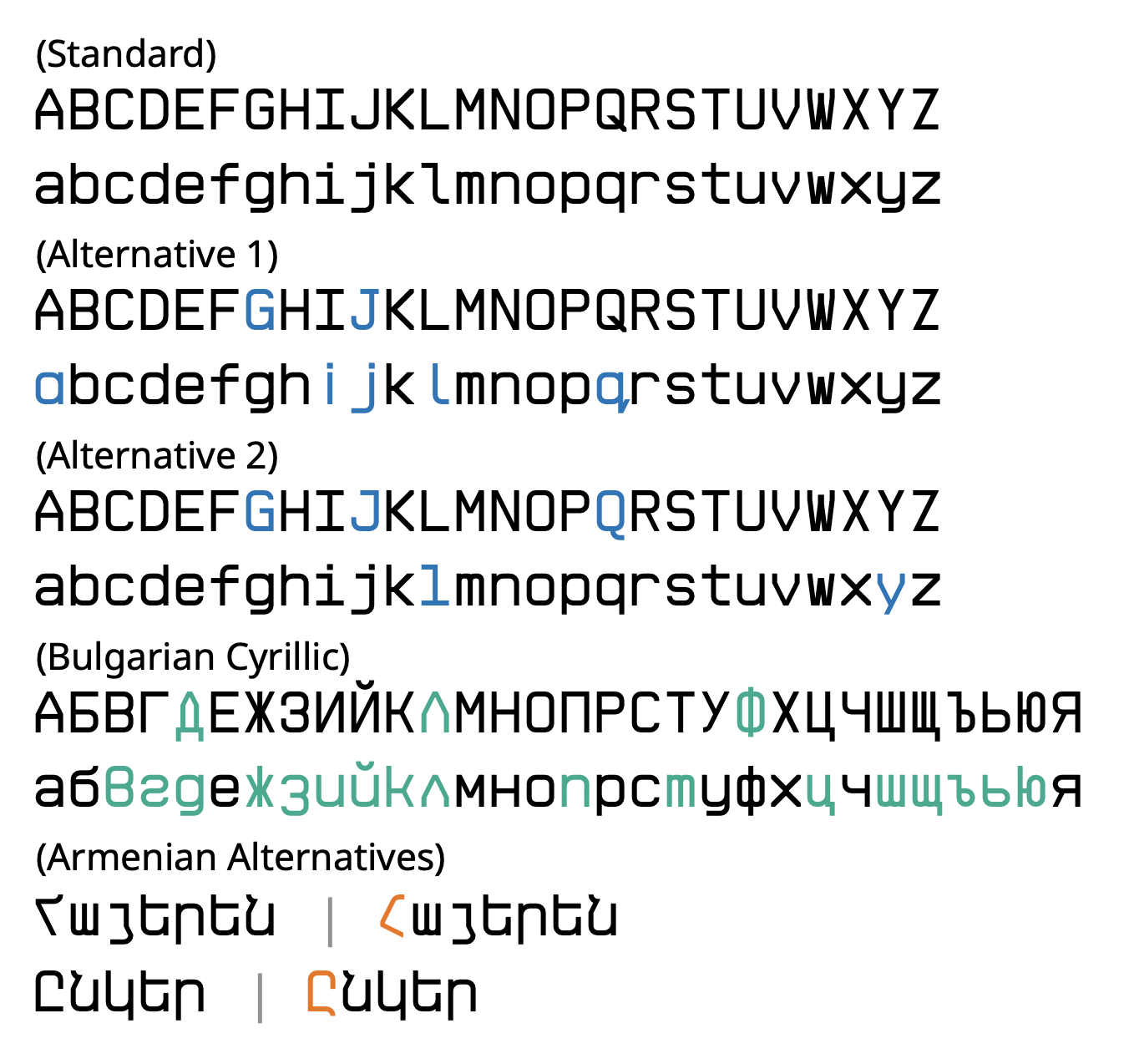

I forgot to publish this one alongside the regular weight yesterday, my mistake.
»