@Patrick H. Lauke (redux) - My only quibble is with the ‘4’ -- compared to the other glyphs, it looks weak and anemic. They could have taken a few more minutes to design a better version. :^)
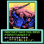
Here is the supplement's character set (as of this writing). I
inserted a full-size capital A and E for comparison. Full set of
alphabetical letters, including
The actual font was only available for Mac computers (albeit older ones) and came on a floppy drive. Though some people have TTFized it, like you can find here: https://compu-lsd.com/archive/fonts
@Catterio: I agree with @Frodo7: even though you may think this font is “nothing special," someone else DID value your efforts -- so take the compliment with humility whenever that work is duly recognized. :^)
Okay, woah. I don't even know how this font is eligible for
Staff Pick… The font is good-looking and has a lot of glyph
coverage, sure. But besides that, there isn't
Hey! I started too, but you faster. So please clone my letters Ф Д д л и й Ы. Also change uc У with lc у, i think it not necessary to make it different from latin y








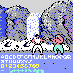
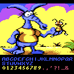
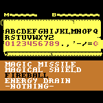
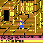
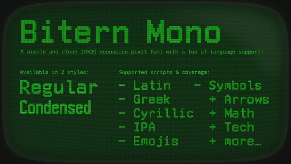
@Patrick H. Lauke (redux) - My only quibble is with the ‘4’ -- compared to the other glyphs, it looks weak and anemic. They could have taken a few more minutes to design a better version. :^)
»