Uh... Portuguese and Japanese next? Just recommending
@BWM Because it IS inspired off of the Chicago font. (not being mean btw)
Told them the font of Freevee was free to use!
I loved this.
as the creator of the original font, i am thouroughly disappointed
& this is horrible
why
i like this
no it ain't
Nice.
I love this! :) 10/10
*ahem*
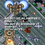
"A V V V V V V V V F H Y X F D Y H Y XW W WY XY XF D W VW VWY X
Never mind, I won't do FS New York Regular font anymore until further notice...
also can i expand this font? some letters in my own modification will be changed
you forgot to add the diaeresis in ÿ
Should the name be Continuous Digital Display Extended.
@w7n Now I turned them back into shape. Also, thanks for the constructive criticism. :thumbs_up:
what
spam warning ⚠
This is so cool!
I recommend to add all-on glyph
Eu gostei da fonte!
Next font: FS New York Regular
i made stopnese justov
where is Ѽѽ ???
lachen pls comment "why letters split? also cool"
justov
looks like justov but cool
its not justov
nice!
hi


Uh... Portuguese and Japanese next? Just recommending
»