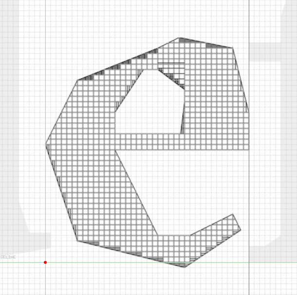
I only noticed change o 3 of them 6 and 9 which I like better more open now, on 4 I cant decide, new one fits better the set, old I like better in general.
I like the old 4 more, but for the others, the new ones are better (could have one form as an alt; the Private Use Area is a great place for that as it doesn't intefere with Unicode allocations)
@MrBook Not a very good idea to do that for unicameral scripts,
you can't just have the glyphs be different in what is technically
the upercase and lowercase
You know you could have just used case sensitivity, as the Kynaatt alphabet is only 40 letters long, like this: aABCbcdDXeEfgGhijklLmnNoOQprRsStuUvxyYzZ
A very refined faceted typeface style. As a result you have
created a beautiful font. I quite like the shapes of each glyph.
They conform to your creative logic
One of the problems we mentioned is that there's
nothing "new" being created anymore. The book has a similar issue
that is brought up—but instead of a typeface, it is a song.
@caterpillar's.kimono: I'm new here, great font btw. I'd ignore the negativity, nothing about that font is underwhelming. I don't think everyone manages to grasp the finer points that exemplify a good critique.
Absolute masterclass, great work! Your font really deserves the "Top Pick" badge!
»