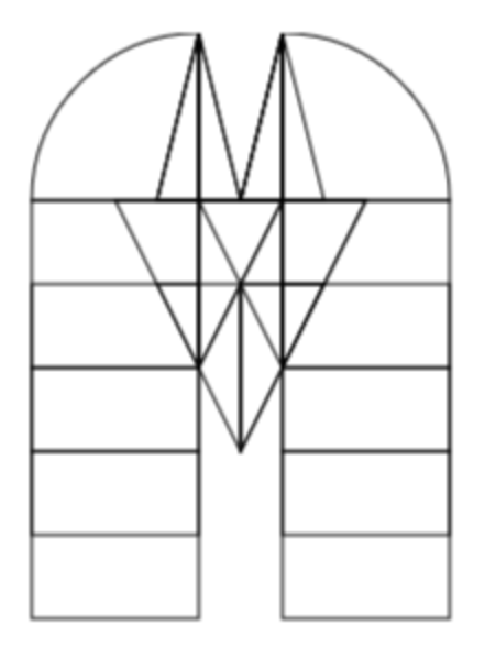
@Frodo7: Thanks. I’m actually thinking of adding an alternative version of each letter with a short swash to resolve this conflicts, but I don’t yet know where would be the best place to put them.
@kassymkulov: Thank you. It took me two and a half months to get to this level because of the summer heatwaves. It is difficult to do any creative work when your brain is cooked.
@Bryndan W. Meyerholt: Thank you for your comment and rating. Salice is Italian for slender, willowy. It is pronounced as sa·li·che, similar to the brand name Versace.
Like the previous comment said, it isn't really a "monospaced" font—some characters, especially the letter M and the numeral 1, are either shorter or longer in length. Nice attempt, though!
@XLS2009 (Win Products): I very much like your works. They are
precise, consistent, and of high quality. The originality of pixel
fonts, especially at small
Just like I said, I'm have a new strategy to improve fonts apart
from just using FontStruct. I'm will make some proportional or
monospaced font remakes
Unortunately, I'm not sure winch Latin glyphs was used. If you see rare glyphs being used, just don't be minded. You just need to at least being liked at the font, and everyone have their own choice and decision of their own font.
@Frodo7: Thanks. I’m actually thinking of adding an alternative version of each letter with a short swash to resolve this conflicts, but I don’t yet know where would be the best place to put them.
»