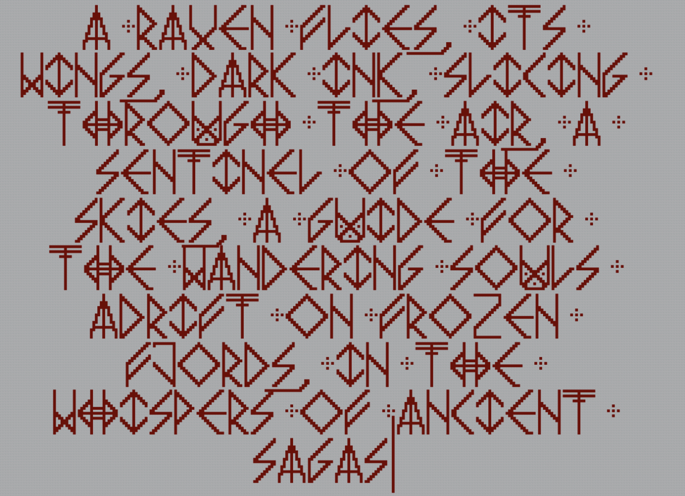
Is it me or does Ը kind of resemble Հ (Bolorgir style)?
Lisa Yani, I know if the “R” leg is curved, but I may update the font once I have a time. Thanks for your feedback!
This font looks great, but in the Quicksand font, the capital “R” supposed to have curved leg.
@ɘllipvl that is how it looks in the game
also, (not) sorry to say this, but
the symbol in between £ and yen is wrong
try fixing thorn and eszett by:
thorn: putting a halfbrick in the middle
eszett: using the curves from 3/B/&
oh and also fix eth and o-slash (and oe)
and try using the s from the actual font in the st ligature
Funny how me trying to make the original font “HD” was just a dumb decision I decided to roll with at first. XD
My Fontstruct knowledge was limited
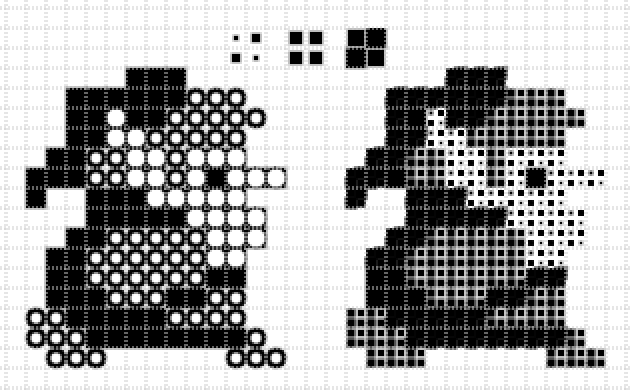
Is it me or are the lit segments a bit off to the right in the samples?
I think you were on to something, improve and may be a TP.
Preview
400 characters
@MagicBear - Sorry I missed this one last month; I only just saw it on the most recent DaFont update. Looking forward to more of your pixel fonts! :^)
500 characters
yee
@Rob Meek: Thank you very much for the Top Pick. (Your comment is not visible here, but the pink star is.)
@Dmitriy Sychiov (Sychoff): Thank you.
@Gr4ftY (groan): Thank you. Last night I reworked the ink traps for all letters
@frodo7: Congrats on the TP!
Look, on the topic of M & N, you can do whatever you want—I’m not the best voice when it comes to consistency. I like the
Congrates!
@18man thanks :)
Hi MVBit, I absolutely love this font! I would love to add your font inside it with full attribution to your name. However, I noticed it is currently
@Gr4ftY (groan): Thank you for your comment. The strokes of the capitals are one brick thicker than those of the lowercase. I wasn't sure about the
Another cool angular design! The weight is well balanced. Love the inktraps too—though I am curious as to whether leaving them out on the M and N was
boy oh boy, i am excited
this is amazing
@miguelgill this is the better font, and there's nothing you can do about it
add the icons in the top corners
thank you for making this font
because
now i can recreate the DYMO font
this is DEFINITELY not Arial at ALL
@scratch_meow not everyone needs more latin
i'm (not) sorry, but this isn't arial
I wonder what scripts the letters came from, I know one of them was Armenian.
btw, hi i'm 18font/ambikaf/blahblahblah
also hey, hi and hello, 18font here
@Frodo7: Thanks. I’m actually thinking of adding an alternative version of each letter with a short swash to resolve this conflicts, but I don’t yet know where would be the best place to put them.