@Peter (Petruuccio): Thank you for your comment and generous
rating. I'm still considering your suggestions to make the
terminals more uniform and get closer to the original look. I
replaced the lambda-style m and gave the
z
I've made a lot of small changes. The m, t, and z have been redesigned. I created new capitals for I, J, L, S, and T. The extended Latin set nearly covers all Western alphabets.
Make these 11, then for the other 33, you can either create them with seperate composites, for flip those horizontally and vertically to quickly make them.
"It would have been better if you set your long text with your font: 山寨专业版. I feel sorry for the unfortunate letters that were squeezed mercilessly to fit the same width."
Also, Unified Canadian Aboriginal Syllables should be Unified Canadian Aboriginal Syllabics, and Unified Canadian Aboriginal Syllables Extended should be Unified Canadian Aboriginal Syllabics Extended.


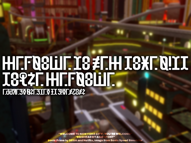


@four: thank you for your kind words. I wrote a short note about how the Tengwar-to-Latin translation was formulated.
Design notes for Elrond (Latin)
Elrond
… more