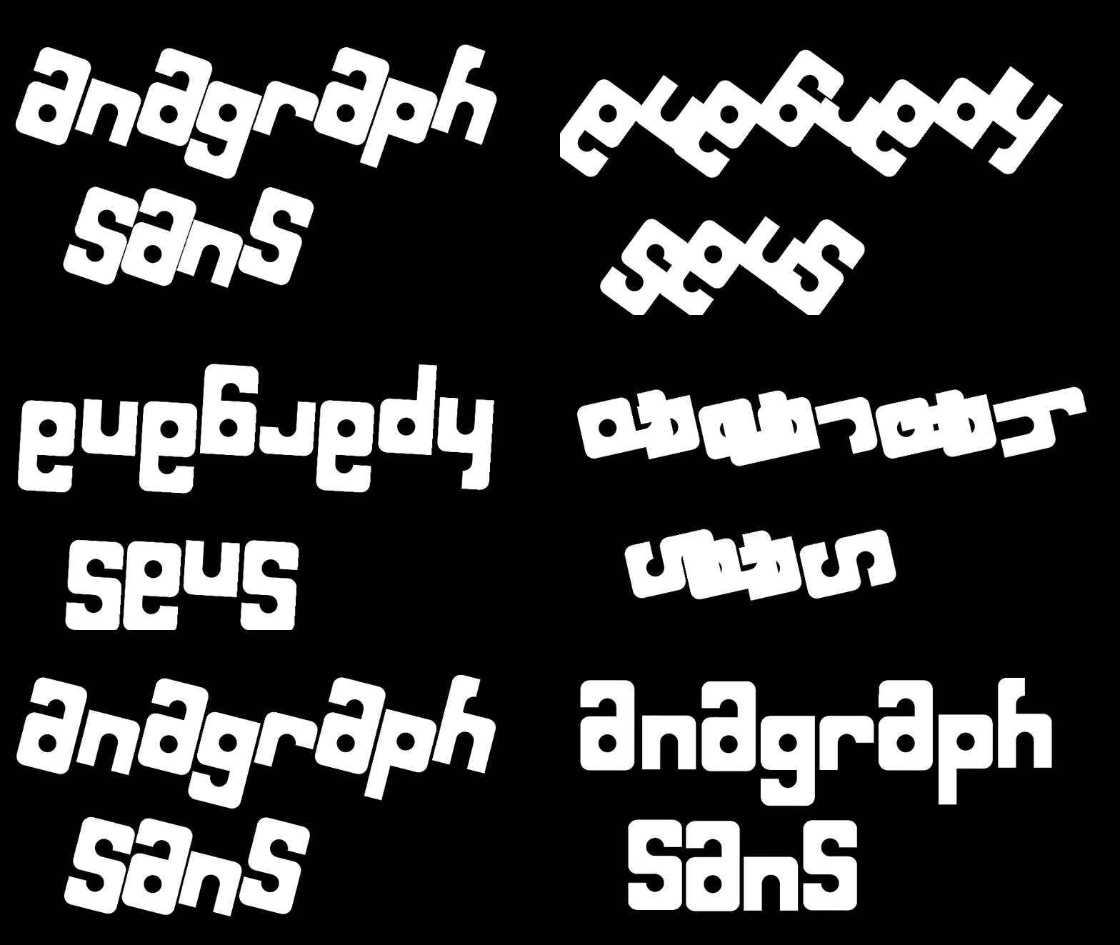
Why are you closing comments in your FontStructions?
i meant the sample that @tsafs posted, sorry
@ctcg_ thx
(note: not real smallest)
what
i keep getting ipa & pua confused 😵💫
cool logo
This font now has 10,001 glyphs.
haha, very funny. :|
I'm getting closer to 10,000 glyphs!
Also, can you add more kerning for French and Czech languages?
It kind of reminds me of Zyzoon.
That looks great. I like its color scheme!
It looks cool!
@NewCurvenBig Do you have an alt account?
@Stephen23 Try contacting Sychoff directly, and see if he can grant you a license. (Also depends what you wanna use it for: personal project or commercial use?)
Roade flags
Add v w x and y
@18man that would be difficult, as the composite bounding box must be either 4x4 (2x4) or 8x2 (4x2) for two letters per composite
@18man - I assume "(not full)" means that it does not contain a complete character set that may be found elsewhere. If so, was it really necessary
PRotoN NQaLF should be the name because [n] is the NG character
wat is that image
it's simple logic
(not full)
noice
also in the chart, rows 1-3 have too much space between the elements, so here's a correctly spaced table:
H h Lb
@elliqvl why not also make composite for 2 letters in one brick, making the maximum 18, more than enough space to fit even rutherfordium
Bruh
yes you did, because the whole point of the font is the double, and there's only 1 [1] on [1], therefore making it worse
Why are you closing comments in your FontStructions?
»