We’ve removed over 600 identical or minimally altered clones from the gallery. Going forward such clones will be detected automatically and blocked from sharing. (No FontStructions have been or will be deleted for this reason).
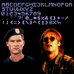
Update: June 10, 2026 - Corrected D and numeral 1 from existing artwork for the “New York City Boy" 12” single (back shows SIDE 1 and SIDE 2). Alternate numeral 1 from March 2022 update is now located in the More Latin section.
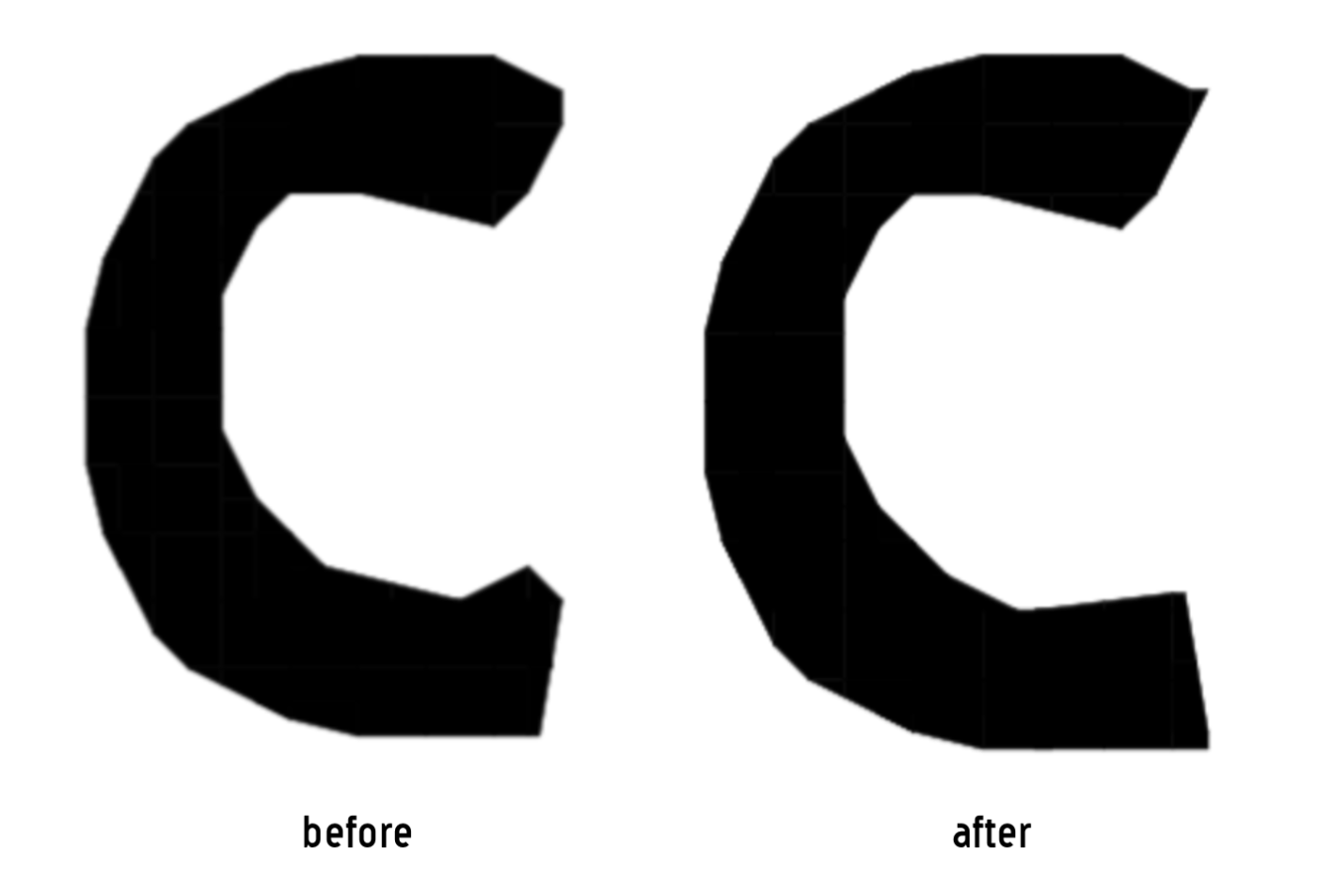
@Frodo7 @Goatmeal, I tried fixing the angles of the M in my State font. I can clearly see the difference using the tutorial that was provided. I am very happy with the result.
@Frodo7 I always wondered why the angels were too thin or too
thick. I thought it was because of the bricks themselves and
how they are placed. Before constructing a new font, I use a
graph composition book to
Dear FontStructors. To counteract spam and other unfontstructive behaviour, we will be experimenting with comment moderation over the next few days. New users, please check out our commenting guidelines.
@Chris Burgess (maneman): You are an old-timer at FontStruct,
and remember, we used to help each other. I wanted to help you with
this project. I saw potential in it.
There is a second issue with the letters: the diagonal parts are
too thick (M, N, V, W) or too thin (X, Y, 4, 7). This problem was
solved many years ago. You may clone










Reminds me of a 3d vhs golden font…
»