I'm with @Frodo7, but I understand your sadness about the 1s. Btw, the serifs are nice.
Congratulations, Maestro! Nice last sample.
Another nice variation. I like it.
Congrats on the TP, Maestra! Welcome back and I'm glad to see you here again! I've trying something similar with this font (but less elegant). 10/10.
Kerning pairs reccomended: AE AO AI Ae Ao Ai ae ao ai aE aO aI (Use -1,04)
Congrats on the TP! These are some wicked cool patterns. Pretty sure you can work out some amazing typefaces with the multi-scale one.
This is fire! Definitely deserves a Top Pick!
Added Latin 1 Supplement
Which Ð Looks better? Double Quarter Square or Pixel?
I checked the real cards, and here's an image of the letters “J” and “V”. The “J” is completely flat on the right side, and the “V” seems to have
alt б
Nice font! Its actually nice
Nice dingbats. 10/10
Nice font!
Hwæt! We Gardena in geardagum
Now this is really cool! Medieval fonts need more attention.
This is already really cool! I hope you keep adding to it!
Pretty nice pixel script font. I have a couple questions:
I wonder why pressing X produces the sequence “XYZ”? I'm not particularly a big fan of the short
300 characters
one problem is that the letter “J” and “V” are a little bit wrong, and the letter “B” should be more rounded, but the font is still good
@19521chaos yes i do
@chirinea - A very nice selection of video game fonts you have just published. They have been added to the “Game Recreations” set. Welcome to The Video Game Font Preservation Society™ ! :^)
https://fontstruct.com/news/author/the-video-game-font-preservation-society/
Thanks!
Latin 1 Supplement
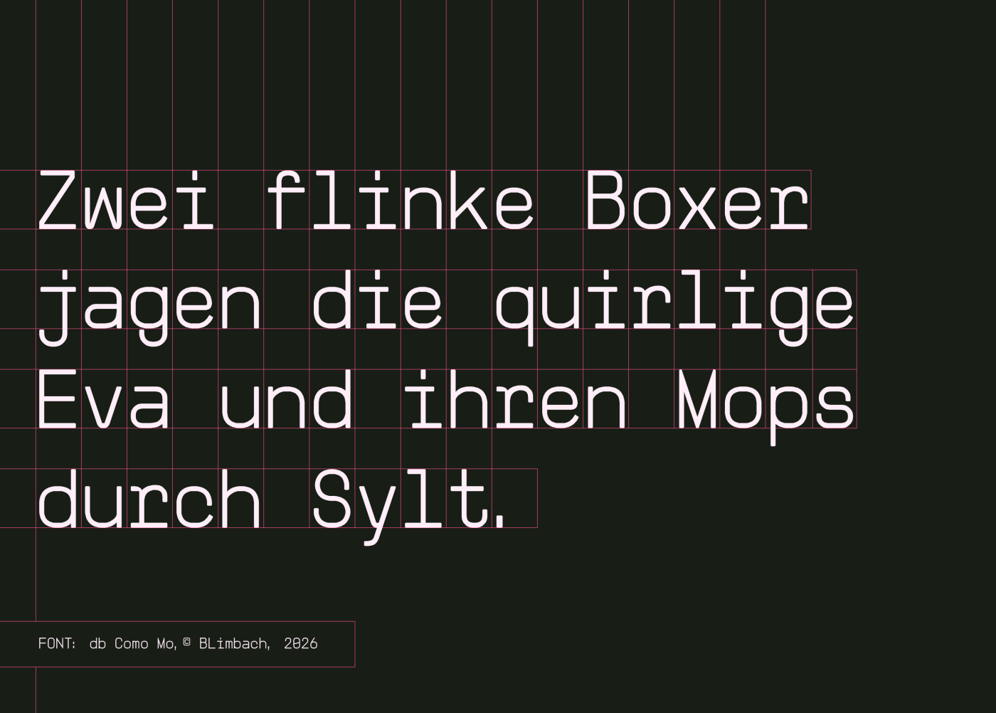
Hey@Rob Meek: Thank you for another TP Star for my db Como!