vro ts aint lookin like Luckiest Guy 🥀
u Looks like ü
@Frodo7 what?
i'm so dumb bruh...
serbian letters talled up
Your portfolio is very impressive. The modular fonts, papercuts, and other visual artworks are silent testaments of a happy man. I wish you the best.
i had a road map that went:
quartile slab -> imisislab -> triplequartile slab -> slab
i made the first two, but realised that imisislab
i made the first two, but realised that imisislab was already
between versions 42 glyphs were added
version 2: 26X25, addition of lowercase letters, all remaining basic symbols and the creation of slab
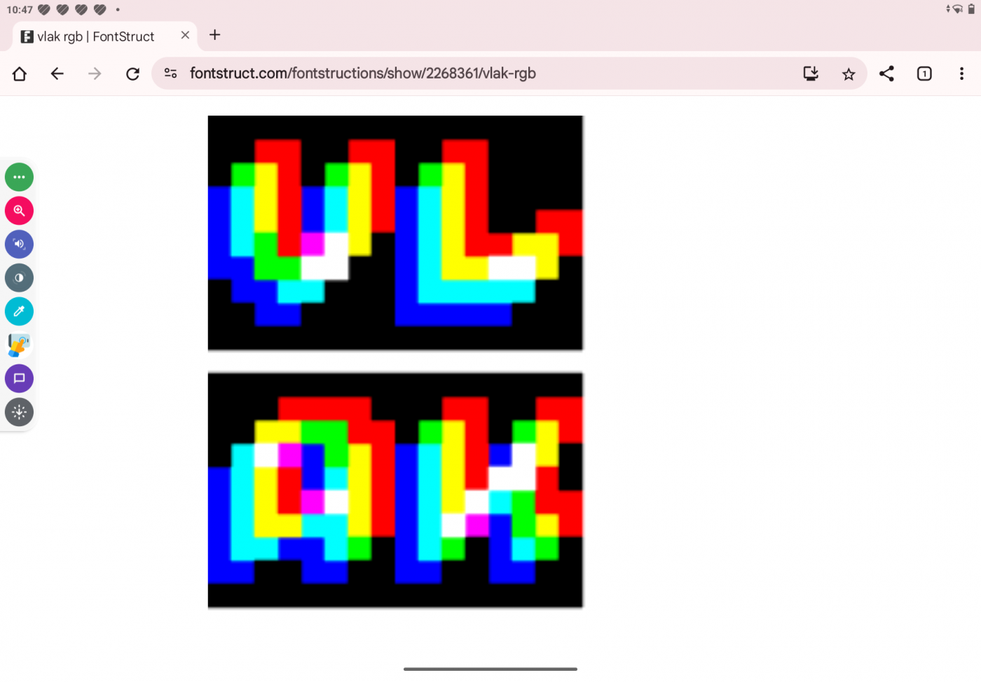
@Can'tfind1usernamecanI? the font used changes width, probably to adapt to different screen ratios (such as 16:9 to 3:4 to 5:4 etc) i guess
How about this
This is what the font would look like on an actual EAS screen.
In Schools, Teachers Know What is the 1st grade
DiH🥀
Can you fix your font
Digits 0-9 are o
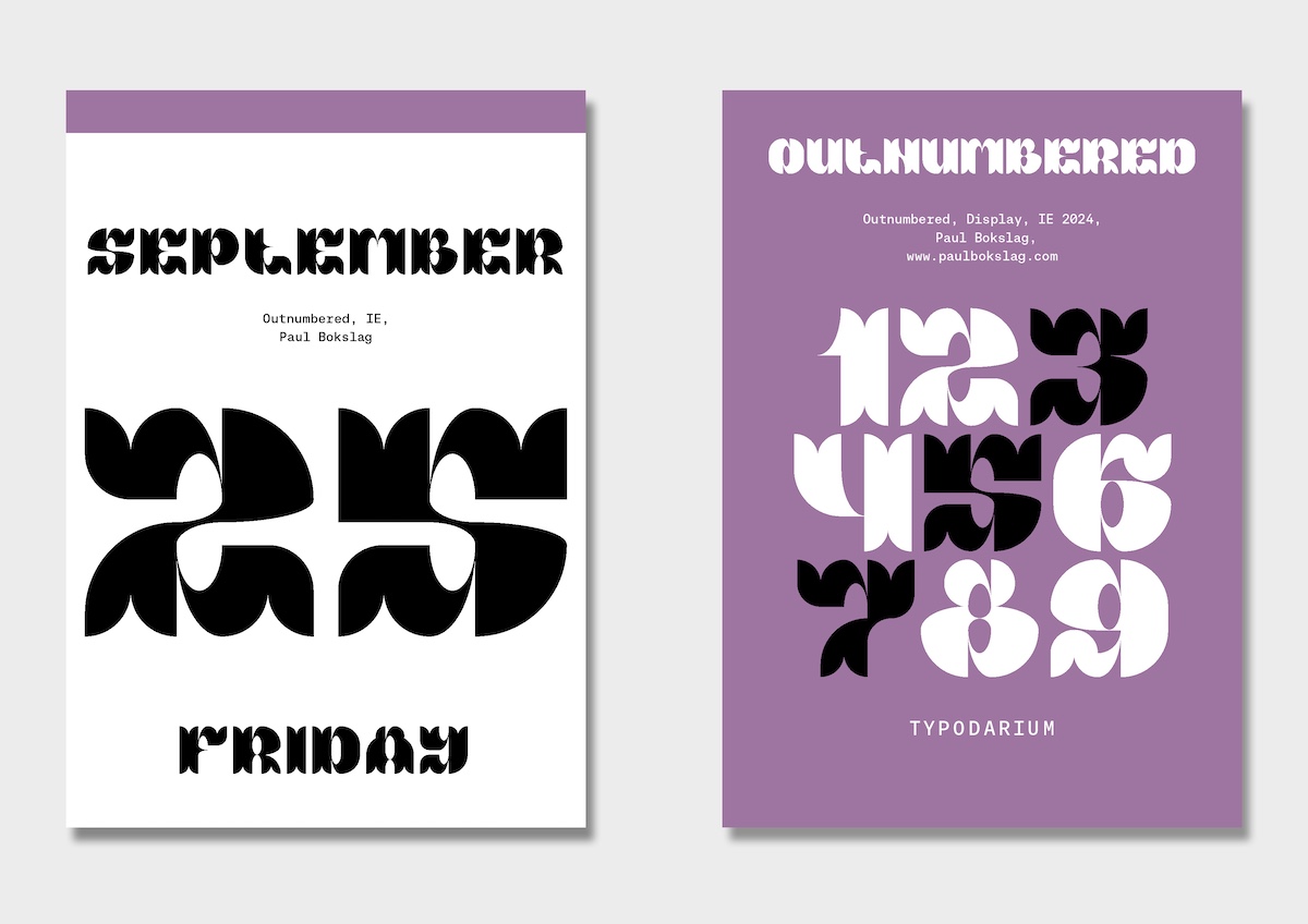
Strong and consistent. The serifs in the top left corner are a nice touch.
Powerful contrast between heavy strokes and small counters. The kerning lifts it to the next level.
Beautiful curves, a wonderful piece of work!
yay new update
ngl i feel like u have a problem on saying peoples real names (not to be rude)
This looks similar to 9x5 Ultimate...
Where did you make it with?
yes
It seems the turn has table'd.








vro ts aint lookin like Luckiest Guy 🥀
»