Love the little loop in the "W"
Here are all the sides.
good font, but the consonants should be smaller and a bit closer to the vowels.
Which game are you working on?
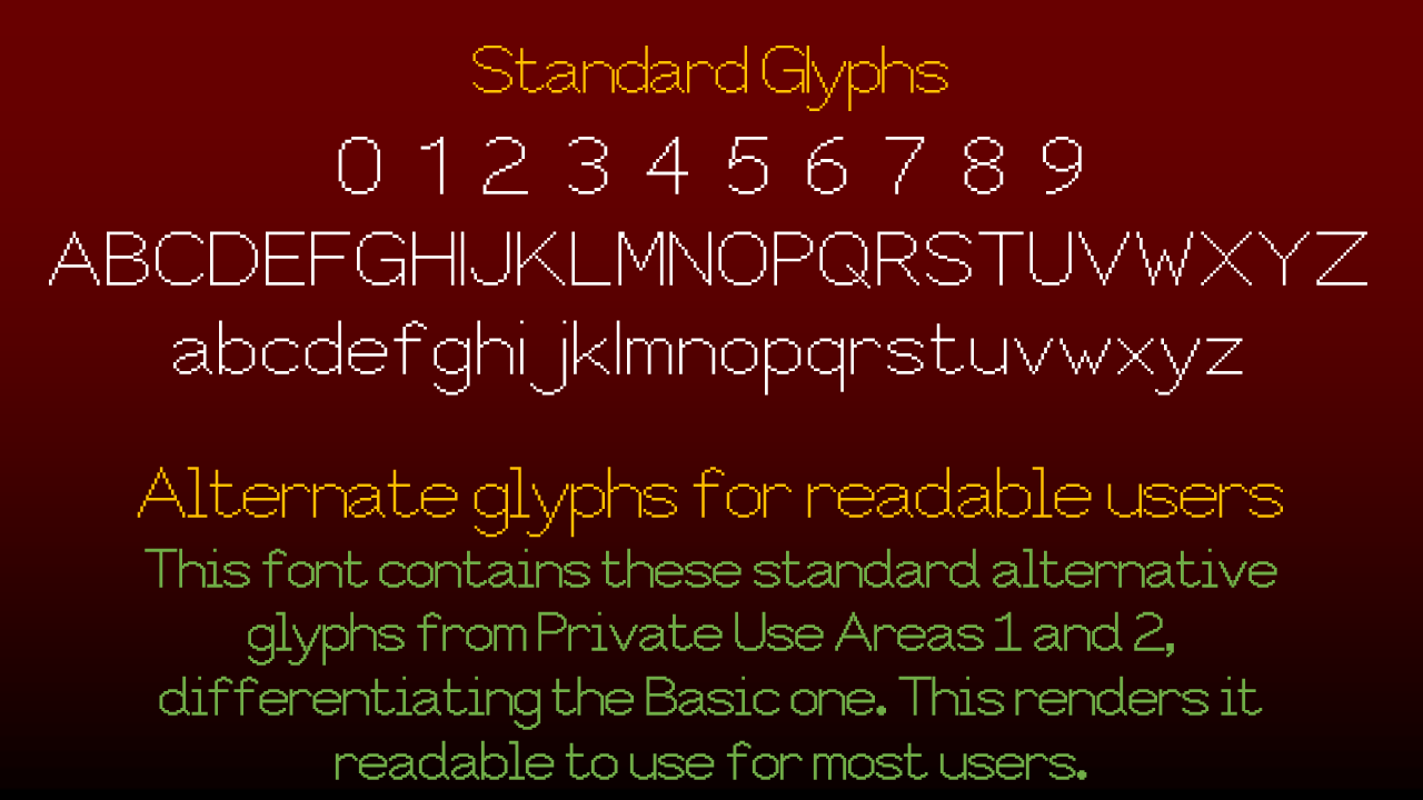
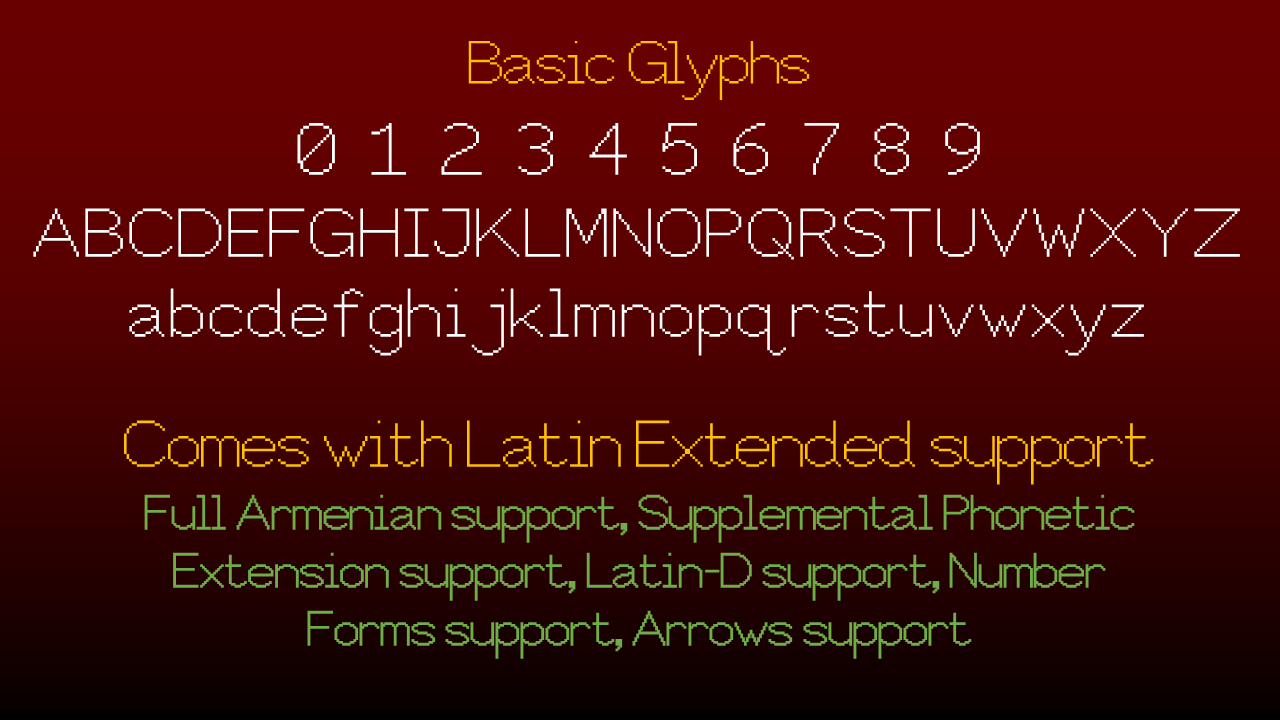
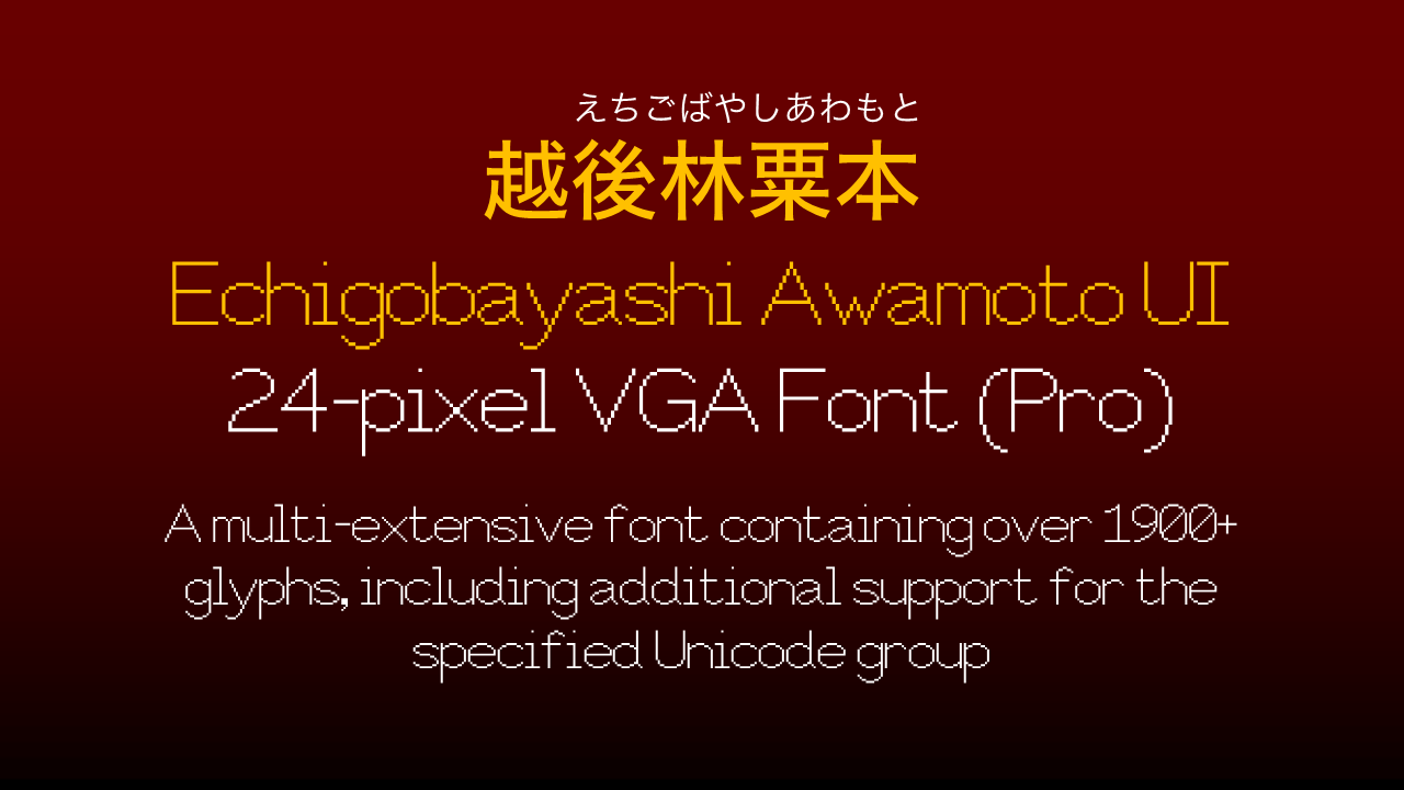
@JOEY this font has around 350-400 more glyphs than the original.
@Patrick H. Lauke (redux) - Always amazing to me how a few shifted pixels here and there can change the style of a font and make it look Germanic / Old English / Uncial.
this is not funny
I searched up "youtube He's Obsessed ad" on a search engine, therefore meaning that I didn't break that rule
also how the hell do you smoke bees???
also
cuz they were tired of spam
also they're the same person: lucapri
The tag spam...
But why are all the digitalios leaving?
Yes, they have to. @Ivqille
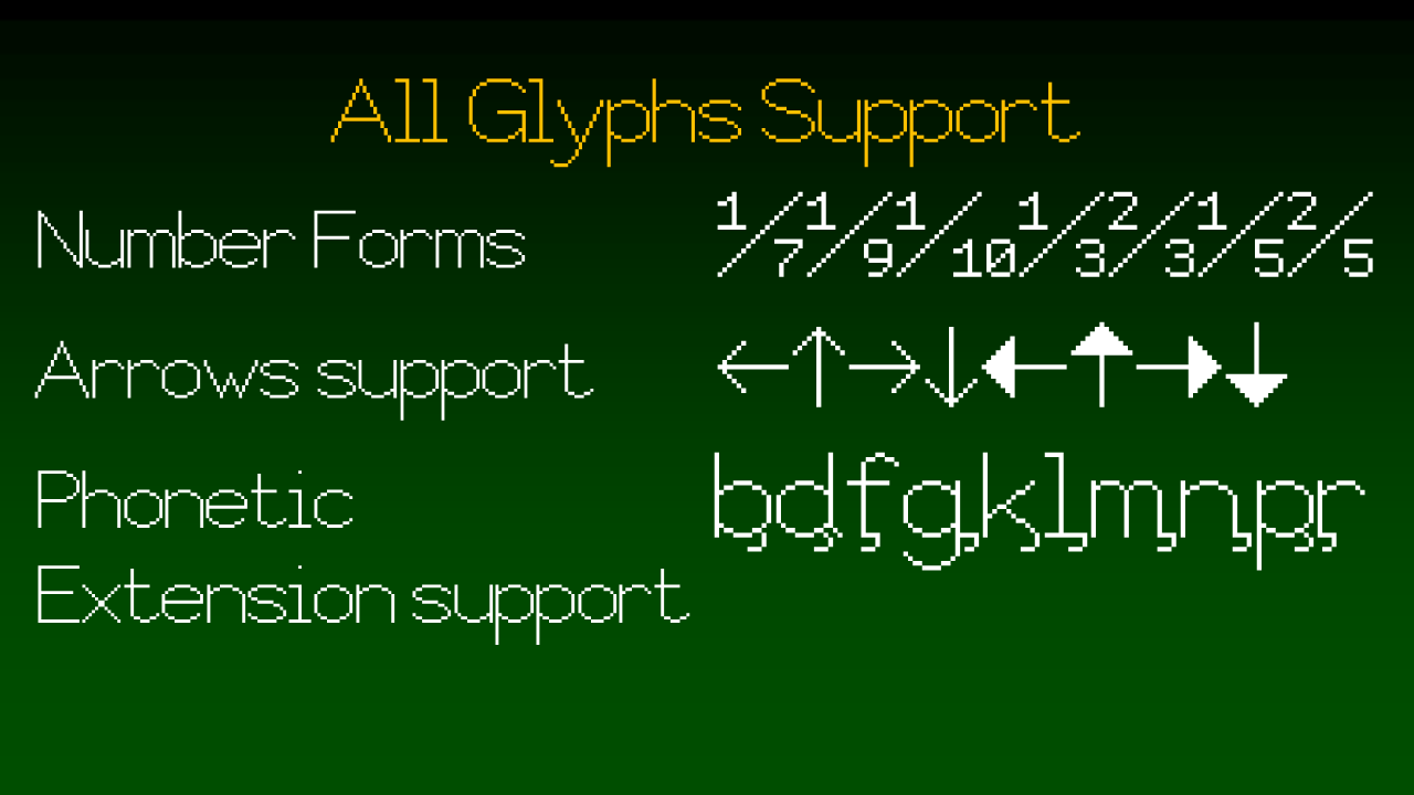
Why won't you add more letters... Here's my image of numbers.
it kinda looks like Unifont tho
Okay, that's pretty good.
This HAS to be a staff pick
Wow! Well done on making a kid-friendly font. It's GREAT, I'd download it if possible!
Clever!
cool 10/10
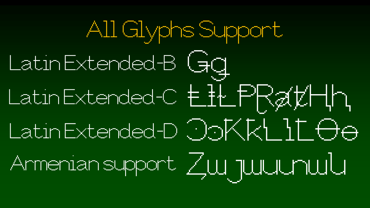
Added the remaining Unicode 5.1 Latin characters.
CCC: 3,005
i aggre with everything
but you had to add serifs to differentiate, which contradicts the subtitle
That is not chinese
It's japanese (Katakana)
My font isn't made to serifize, particularly adding more serifs.
It's simply a mere remake to Captions Inc., but I made it to look distinguishable and distinctive,
nahh we got C Unicode before GTA 6...
circle