@Techstar01, no, Cyrillic glyphs look fine although I can’t comment on their authenticity as to the original Geneva. There’s just one bug from what I can see – lowercase й lacks its breve.
This must have taken quite a good amount of time to work on, especially since this is a monospace font, with so many glyphs done for it. Superbly done.


.png)

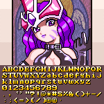
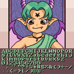


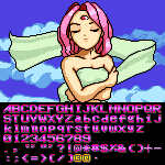
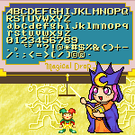


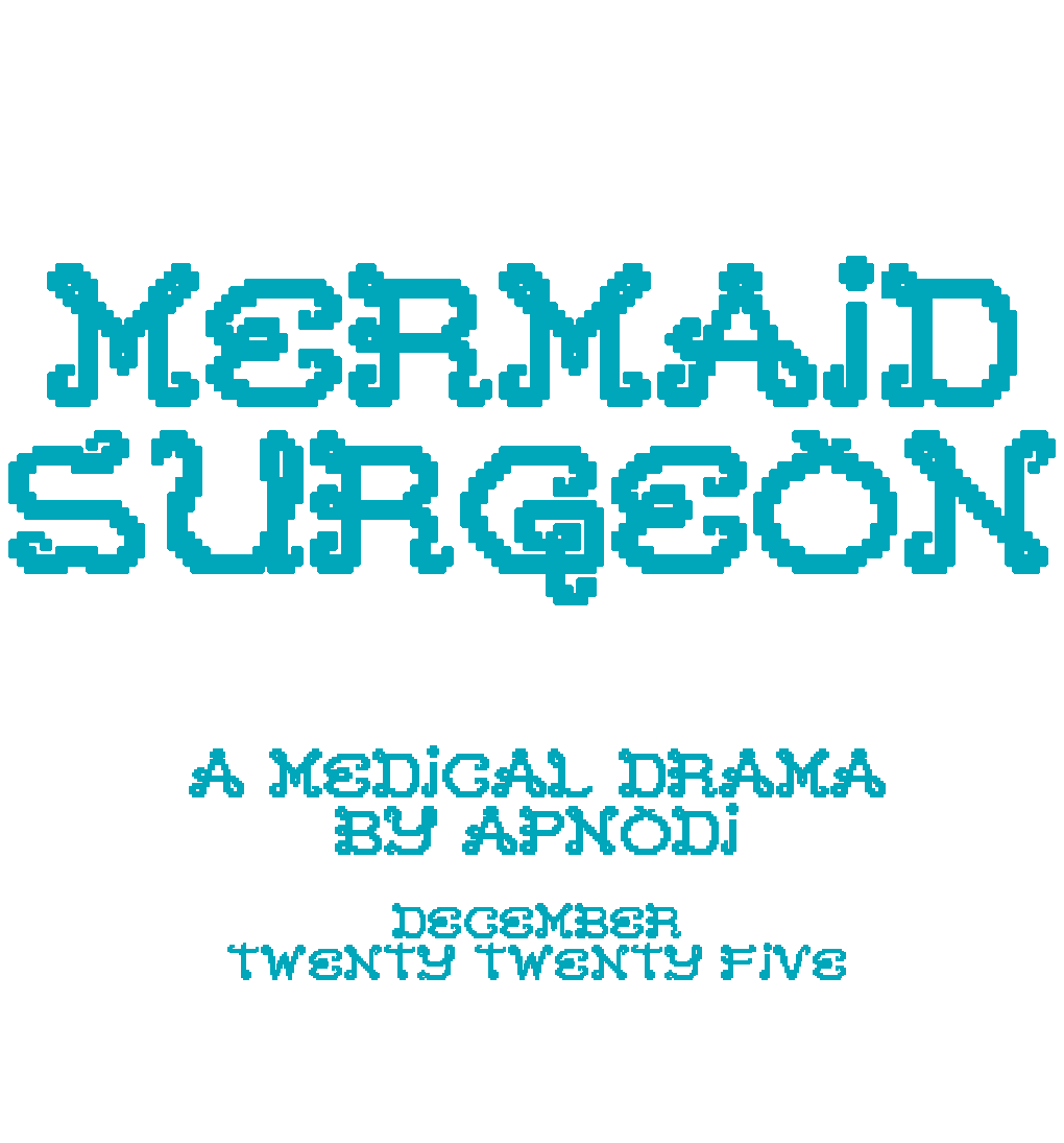

This feels both slightly Warhol-y and a little reminiscent of the JoJo’s Bizarre Adventure: Battle Tendency anime adaptation colour palette!
»