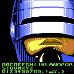
WOW! Authentic "old school" style, yet modern. How I sometimes miss those carefree and creative years, but there you are, still bringing new styles into the present that remain relevant. Thanks a lot, compa!
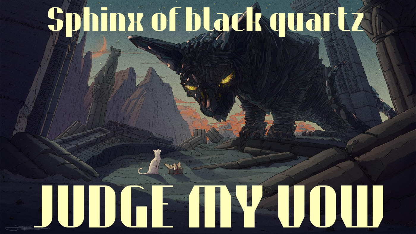
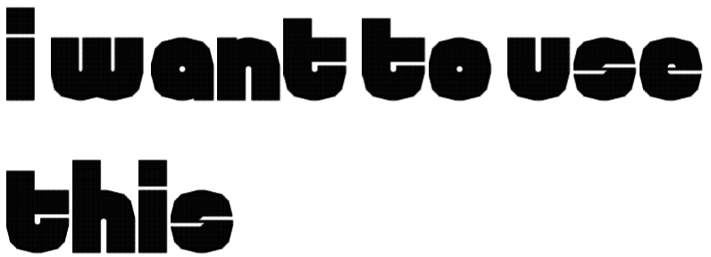
@TypoMan Foundry It's bold and attention grabbing, all the similar letterforms are different, and the accents are large enough to tell apart even from afar
I wonder where the dash that appears in the mine count when you place too many flags on the grid is? It's composed of the middle horizontal segment by itself.
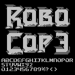
@Patrick H. Lauke (redux) - Very nice recreation. They almost had the logo '3' correct on the title screen. A few more angled tweeks and it would have been movie-accurate. ;^)








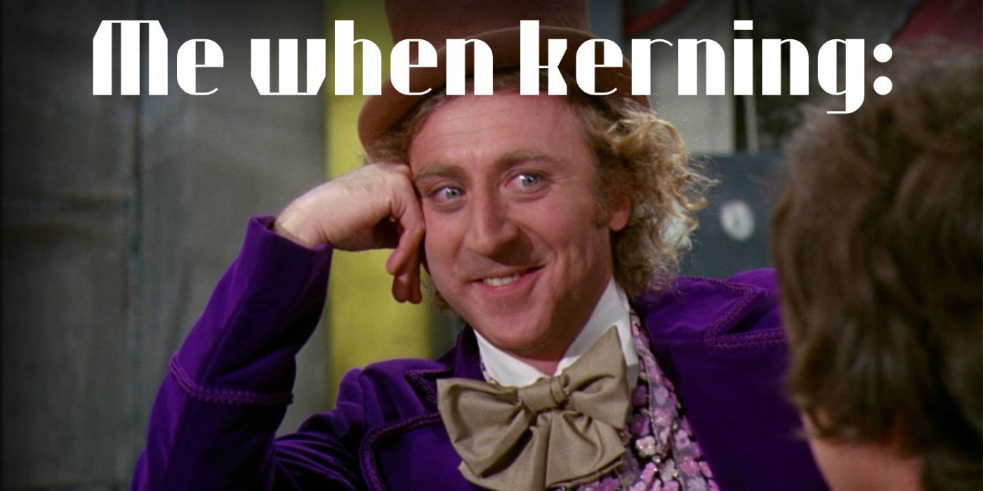






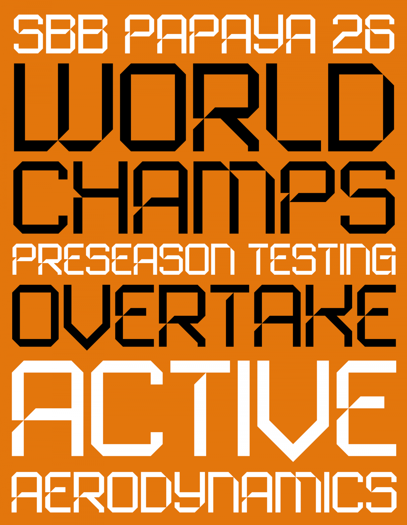
And what do you think about this horizontal flip on the N?
»