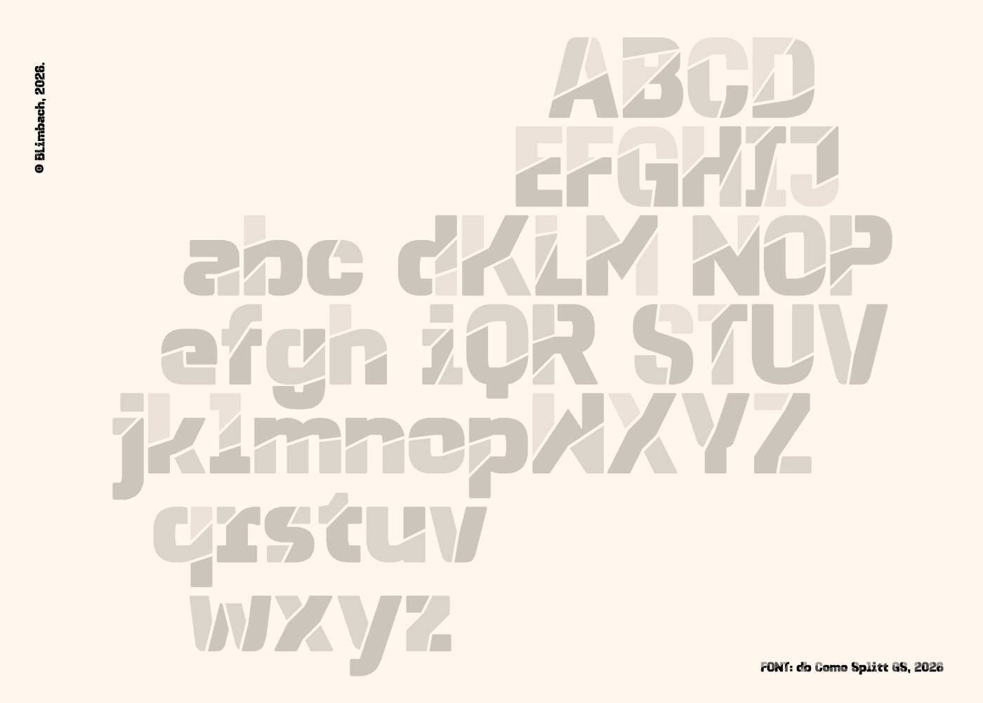
Heavy sans serif with playful stencil cuts at various angles. Extended Latin set. Great addition to the Como family. 10/10
PS: stray pixels at letter a and ‰.
You keep saying “Added [Language/Characters]” in the comments on your fonts.
Also i want fontstruct to have a dark mode which was supposed to exist earlier.
I wish fontstruct had some great improvements that were suppoesed to exist earlier
Added Czech
I don’t know how you manage this; pretty much everything you put out is a polished masterpiece.
@faux_icing: I beg to disagree. This would be far more applicatory at a bouldering gym. ;)
Some site updates today. There are some teething problems. We’re working on it.
200 characters
Added Basic Latin and Polish
Interesting variation on your Como family. I can foresee the splits being used in other ways, like pizza slices, stained glass, or cardboard cutouts. (✯ᴗ✯)
@ex: Thank you for your kind comments! Glad you enjoyed the article. ^_^
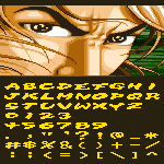
The Display is 22 pixel tall to make small display fit through the display (The font is incoming)








Heavy sans serif with playful stencil cuts at various angles. Extended Latin set. Great addition to the Como family. 10/10
PS: stray pixels at letter a and ‰.
»