Is it me or does Ը kind of resemble Հ (Bolorgir style)?
Good Job!
Lisa Yani, I know if the “R” leg is curved, but I may update the font once I have a time. Thanks for your feedback!
This font looks great, but in the Quicksand font, the capital “R” supposed to have curved leg.
@ɘllipvl that is how it looks in the game
also, (not) sorry to say this, but
the symbol in between £ and yen is wrong
try fixing thorn and eszett by:
thorn: putting a halfbrick in the middle
eszett: using the curves from 3/B/&
oh and also fix eth and o-slash (and oe)
and try using the s from the actual font in the st ligature
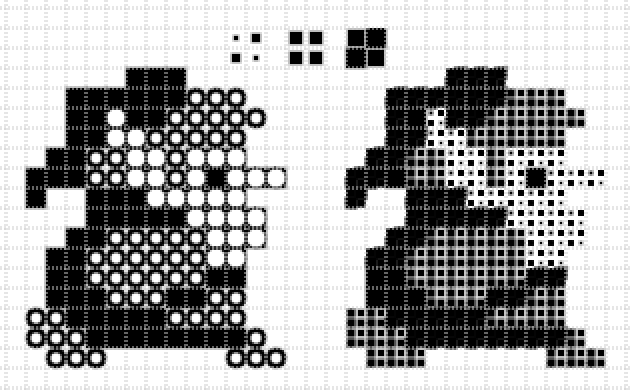
Funny how me trying to make the original font “HD” was just a dumb decision I decided to roll with at first. XD
My Fontstruct knowledge was limited
only 0 to 999,999,999,999 A-E lowercase replaced withA: 10B: 100C: 1,000D: 10,000E: 100,000,000
I think you were on to something, improve and may be a TP.
Preview
400 characters
Is it me or does Ը kind of resemble Հ (Bolorgir style)?
»