𝖶𝖧𝖮 𝖣𝖨𝖣 𝖳𝖧𝖨𝖲? (𝖳𝗁𝗂𝗌 𝗂𝗌 𝖺 𝟣/𝟣𝟢 𝗋𝖺𝗍𝗂𝗇𝗀)
AND IF I DO NOT GET A DIRECT ANSWER, THIS WILL BE REPORTED TO ROB MEEK. THE MEAN FONTSTRUCTER WHO DID THIS SHALL BE
did fontstruct's comments break or something
@Patrick H. Lauke (redux) - My only quibble is with the ‘4’ -- compared to the other glyphs, it looks weak and anemic. They could have taken a few more minutes to design a better version. :^)
What?
Also, I frogot to finish W…
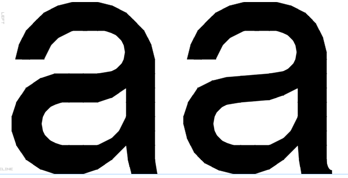
Changed the letters “a” and “s” and their diacritics, to look more like Helvetica: (before: left, after: right)
^what?
T remains the same


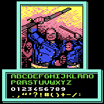




𝖶𝖧𝖮 𝖣𝖨𝖣 𝖳𝖧𝖨𝖲? (𝖳𝗁𝗂𝗌 𝗂𝗌 𝖺 𝟣/𝟣𝟢 𝗋𝖺𝗍𝗂𝗇𝗀)
AND IF I DO NOT GET A DIRECT ANSWER, THIS WILL BE REPORTED TO ROB MEEK. THE MEAN FONTSTRUCTER WHO DID THIS SHALL BE
… more