forward … starting with the cloned monochrome version, colouring over the black pixels of each letter, then at the end deleting all of the monochrome version pixels and reusing the layer just for the shadow
Did you do is forward (place one color brick at a time) or reverse (pasted full square gradient, drew the black shadows, and erased unwanted color blocks)?
The unofficial big-bubble pixel font used in the Amazing World of Gumball logo! Recreated the pixel font part on the logo that says “GUMBALL”, and turned it into a whole font!
Thank you so much! Why is the “Remove empty glyphs” hidden in a
secret place that I have never touched?? It seems to have fixed the
broken font now.
Also




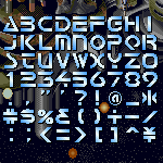


Wow! Imagine the names of certain car companies in this font, they'd be frothing for it! Nice work!
Also, the “Top Pick” choice award by FontStruct is well-deserved, so… :)
»