Or might be test this font.
Effective mix of stroke weights and some lovely icons.
Excellent. I like how the diacritics are embedded in the outline.
Fascinating and beautiful!
CJK characters will be in sung/ming style.
i completed latin extended-B in just less than 24 hours! (with breaks)
Well, why not make it 7+ or something?
@NewCurvenBig and Miguel Gil: adding the extended Latin characters — with diacritical marks at the top and bottom — would significantly increase the
@TypoMan F & @faux_icing: Fixed. Thank you both for your kind comments.
the reason why this font is for 12+ cause it SCARES LITTLE KIDS!
Nice work! I have been working on a similar outlined typeface myself but with more rounded corners.
You can consider making the legs of 'J' and
What about this new tilde? This can be a new solution?
@ctcg_ i have a question. why are some of your comments have bad grammar? you usually type in good grammars, which is odd...
Only if this were a display-of-your-taste (i.e. all rights reserved) font.
You didn't removed serifs in other glyphs!
Excellent for Minecraft.
How we can 10000 glyphs? (FONTSTRUCT EDITOR WILL BE MAKE SLOWER)




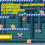


Or might be test this font.
»