@Vienna Binders - You are most welcome. And why wouldn't it be included? You've done a tremendous job here. :^)
Thin..
600 characters
Gratefully appreciated!
Good try, welcome back, I waited.
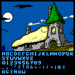
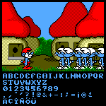
@Goatmeal — I mean, I've been making punctuations and some symbols thinner, and the × sign is a problem as I need somewhat smaller right triangle







@Vienna Binders - You are most welcome. And why wouldn't it be included? You've done a tremendous job here. :^)
»